RE-DESINGING PAYMENT GATEWAY PLATFORM
10.000+
Users
4
Platforms
10+
Brands
850+
Hours
Managing Complexity
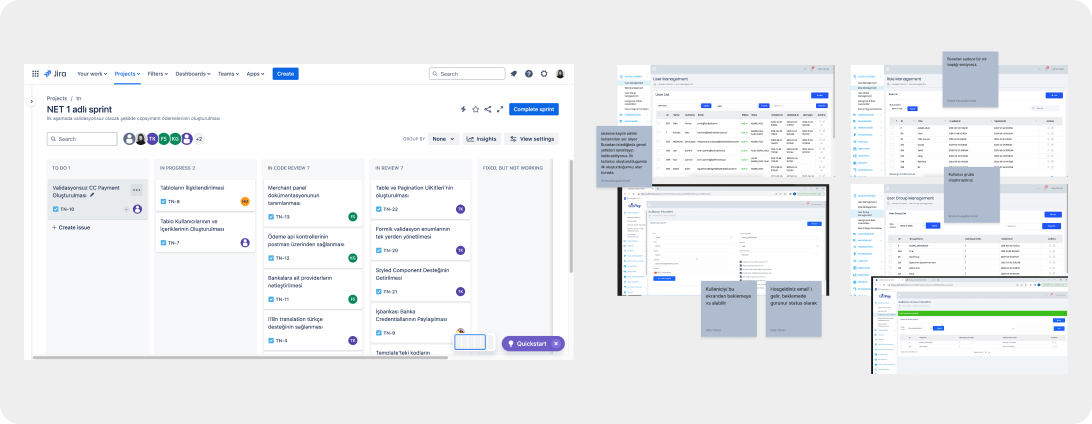
Redesigning a platform with over 600 screens was a complex and demanding challenge. To ensure a structured and efficient workflow, I broke down large tasks into smaller, manageable subtasks and created detailed to-do lists.
This approach was crucial for:
• Clear communication with internal stakeholders.
• Streamlining collaboration across teams.
• Maintaining project momentum without overlooking critical details.
Stakeholder Interviews
The current user experience was unsatisfactory, with Product Managers (PMs) receiving direct calls from customers asking where specific features were located or how certain tasks could be completed. This highlighted discoverability and usability issues within the platform.
Goals
• Analyzing user needs and pain points.
• Gathering insights on the short-term and long-term product plans.
• Understanding team dynamics and customer feedback.
Action
• Conducted 2 weeks of stakeholder interviews with PMs, POs, and the development team.
• Identified user types, account types, and key actions taken by each user.
• This research provided the foundation for a clear strategy for future platform development.
Result
• Created comprehensive documentation of existing user flows, enriched with flowcharts, notes, and insights.
• This documentation became the core foundation for the entire project, ensuring a user-centered approach moving forward.
Contribution
• This process was critical in understanding user needs and shaping the future direction of the platform. The insights gathered through stakeholder interviews and customer feedback formed a clear path forward, ensuring clarity and structure for the entire project.
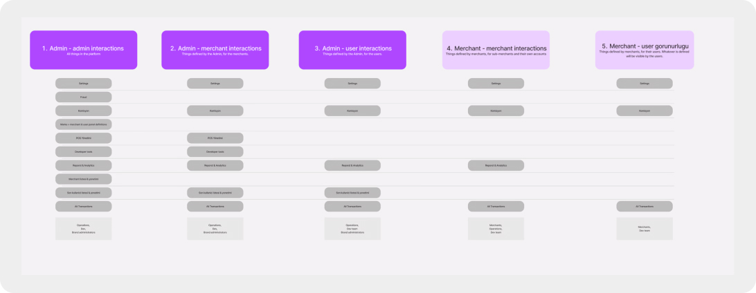
Understanding User Profiles / Personas
Goals
To clearly define user interactions by listing the actions and requirements for each user profile/persona
• Admin – Admin
• Admin – Merchant
• Merchant – Merchant
• Merchant – User
Action
• Collaborated with Product Managers (PMs) to align on the scope of actions for each user role.
• Mapped out the hierarchy of interactions and defined key touchpoints across different user relationships.
Result
• Created comprehensive documentation of existing user flows, enriched with flowcharts, notes, and insights.
• This documentation became the core foundation for the entire project, ensuring a user-centered approach moving forward.
Contribution
• Created a structured inventory of actions, categorized by user profile hierarchy.
• Provided a clear framework for platform functionality, ensuring a seamless and intuitive experience across different user types. This documentation became a key reference for product development, ensuring consistency and clarity in user interactions.
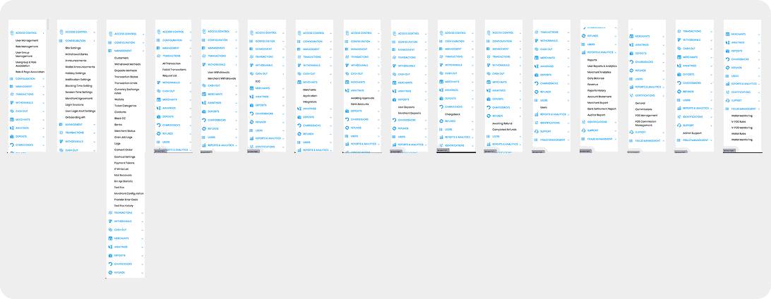
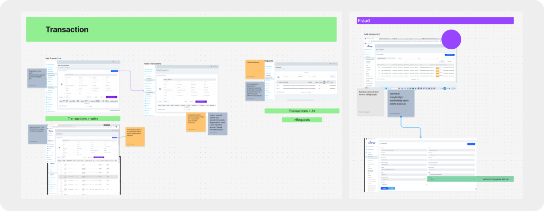
Rebuilding the IA
Goals
The platform’s content hierarchy was unclear, and the information architecture (IA) was confusing, making navigation difficult for users.
Action
• Deconstructed the most critical screens to analyze their structure, usability, and content flow.
• Identified redundancies and inconsistencies in navigation and layout.
• Established a clear and scalable IA to improve findability and user experience.
Result
• Created comprehensive documentation of existing user flows, enriched with flowcharts, notes, and insights.
• This documentation became the core foundation for the entire project, ensuring a user-centered approach moving forward.
Contribution
• Developed a refined and structured information architecture, enhancing clarity, usability, and scalability.
• Improved navigation and content discoverability, ensuring a seamless user experience.
• Provided a foundation for the redesigned platform, aligning user needs with business goals.
• This process led to a more intuitive and efficient platform, reducing cognitive load and improving overall usability.
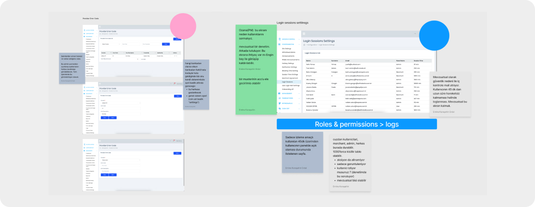
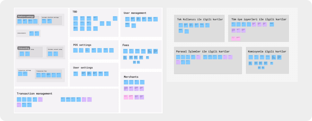
Evaluating Screen Groupings for Better Usability
Goals
After compiling descriptions for color-grouped screens, I needed a way to assess the effectiveness and intuitiveness of these groupings. Ensuring that users could easily navigate and understand the categorization was essential.
Action
• Conducted card sorting sessions with the internal team to evaluate how well the groupings aligned with their mental models. gaps.
• Analyzed feedback to identify patterns, inconsistencies, and usability gaps.
Contribution
• Identified common themes and discrepancies in the way screens were grouped.
• Refined labeling to enhance clarity and usability.
• Gathered key insights for improving navigation, making the system more intuitive.
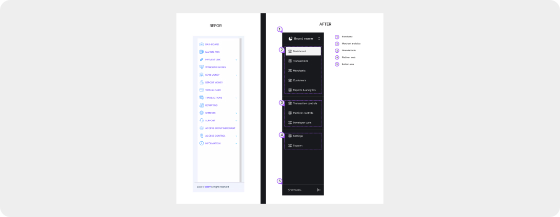
Optimizing Navigation for a Clearer UX
Goals
The existing navigation had significant usability issues:
• All content categories were grouped in a single location, making it difficult to navigate.
• It lacked a clear structure, leading to confusion.
• The navigation did not follow proper UX principles, affecting user efficiency.
Action
• Reorganized menu items based on relevance, user profiles, and insights from card sorting tests.
• Established a logical hierarchy, ensuring seamless navigation.
Contribution
• Improved content discovery by restructuring the left panel into three distinct sections:
✓ General section (visible to all users).
✓ Administrative section (for admin-specific actions).
✓ Platform-related actions (to reduce cognitive load).
• Created a scalable and user-friendly navigation system, enhancing usability and efficiency.
This approach streamlined navigation, making the platform more intuitive and accessible for different user types.
UX Anatomy
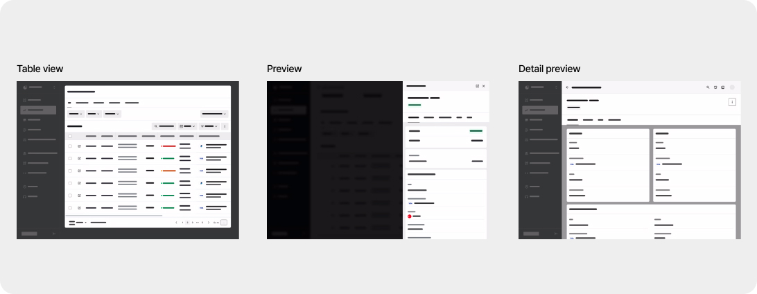
Goals
To ensure an efficient and intuitive user experience, it was essential to identify the core screens that would cover the majority of platform interactions.
Key Insights
• Three primary screens accounted for 80% of platform requirements in terms of UX.
• Users needed:
✓ Summarized view to quickly access key content categories (e.g., transactions, merchants, customers).
✓ Detailed view for individual content items within each category (e.g., a single transaction, merchant, or customer).
Contribution
• Improved content discovery by restructuring the left panel into three distinct sections:
✓ General section (visible to all users).
✓ Administrative section (for admin-specific actions).
✓ Platform-related actions (to reduce cognitive load).
• Created a scalable and user-friendly navigation system, enhancing usability and efficiency.
This approach streamlined navigation, making the platform more intuitive and accessible for different user types.