UX OPTIMIZATION - EXPERT REVIEW & REDESIGN
In this project, we conducted an extensive expert analysis and, as a result, redesigned over 500+ pages of the platform. Throughout this process, several key improvements were implemented to optimize the user experience.This process significantly improved the platform’s user experience, creating a more user-friendly interface both visually and functionally.
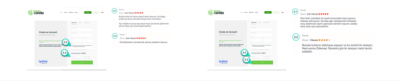
BEFORE
AFTER
Result
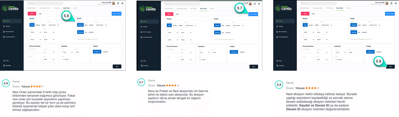
• Unnecessary fields were removed from the form, and only the essential information was requested. Critical fields like email and password were made more prominent, making it easier for users to input the correct data.
• The text and field descriptions in the form were made clearer and more readable. The purpose of each field was explicitly stated, and additional explanations were provided to help users enter the correct information.
• More meaningful action texts were used for users. Instead of "Next," more descriptive text like "Complete Payment" was added, helping users clearly understand the next step.
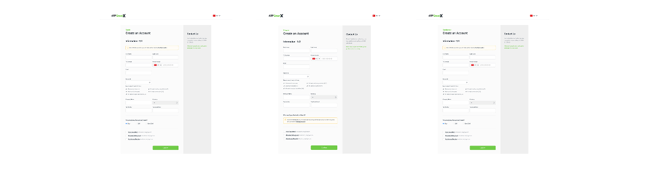
BEFORE
AFTER
Result
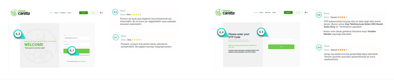
• The login information was redesigned to be more clearly visible for users. The "Welcome" message and login fields were made more prominent.
• The OTP code input was made more compatible with the SMS code sent to the user's phone. Additionally, a "Resend" button was added after the OTP code is entered, allowing users to easily receive a new code in case of errors.
• The OTP code input and password fields were redesigned to be clearer and more understandable. Step-by-step guidance was provided to reduce the likelihood of user errors.
BEFORE
AFTER
Result
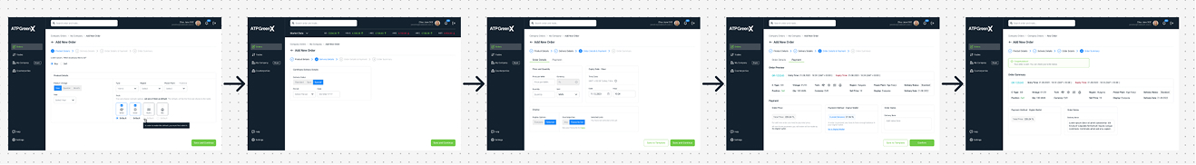
• Unnecessary steps were removed from the form, shortening the transaction time. Users can complete the main tasks more quickly and easily.
• The page layout was reorganized to allow users to access the information they need more efficiently. Data was categorized in a clearer way.
• The text, buttons, form fields, and menus used in the design were standardized. This made it easier for users to understand and trust the platform.
BEFORE
AFTER
Result
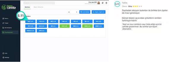
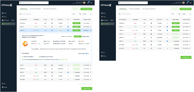
• Action buttons and company colors were made more prominent. The action buttons for each company were designed to be colorful and attention-grabbing, allowing users to easily understand which action to take.
• Color coding was implemented to make it easier to distinguish between companies. A visual separation was created between each company's name and information, enabling users to quickly identify each company and choose the actions they need to take more easily.
• The alignment of data rows and the organized arrangement of information ensured that users can quickly access each company's details and select actions with ease.
Outcome
• Responsive Design – The designs were rebuilt to be fully responsive, ensuring a seamless experience across all devices. This also optimized the mobile user experience.
• Information Architecture Revamp – The information architecture was thoroughly restructured to ensure that users could quickly and effectively access the information they need.
• Flow Adjustments – User flows were streamlined, and processes were rearranged in a more intuitive order, allowing tasks to be completed faster and more efficiently.
• Text and Navigation Refinements – Text was rewritten to be more understandable and to guide users more effectively through the platform.